

About Course
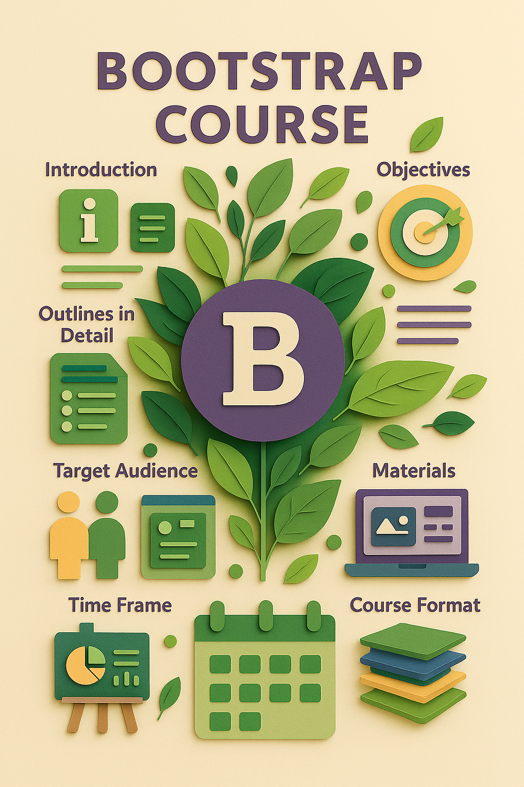
🌐 Bootstrap Course Outline
Course Code: 21065-CS
Duration: ⏳ 6 Weeks
Format: Hybrid / Online
🧭 Introduction
Bootstrap is a leading open-source front-end framework that simplifies the development of responsive and mobile-first websites. It includes pre-designed HTML, CSS, and JavaScript components, allowing developers to build modern, user-friendly interfaces with minimal code.
📘 Course Description
This course equips learners with the skills to use Bootstrap as a practical toolkit for designing responsive web pages. Through hands-on projects, students will explore Bootstrap’s grid system, components, utilities, and JavaScript plugins to build dynamic, visually appealing websites.
🎯 Course Objectives
-
Introduce the core architecture and philosophy of Bootstrap
-
Teach how to build responsive layouts using the grid system
-
Demonstrate the use of pre-built components and utilities
-
Show how to integrate JavaScript plugins for interactivity
-
Guide students in customizing Bootstrap for unique designs
📚 Detailed Course Outline
1️⃣ Bootstrap Overview
-
What is Bootstrap? History and benefits
-
CDN vs local installation
-
Bootstrap folder structure and setup
2️⃣ The Grid System
-
Containers, rows, and columns
-
Responsive breakpoints and layout design
-
Nesting columns and content alignment
3️⃣ Bootstrap Components
-
Navigation bars and dropdown menus
-
Cards, buttons, badges, and alerts
-
Forms and input groups with validation
-
Modals, tooltips, and popovers
4️⃣ Utilities and Helpers
-
Spacing (margin/padding) and sizing classes
-
Colors, backgrounds, and typography
-
Flex utilities, alignment, positioning
5️⃣ Customization
-
Theming using Sass and Bootstrap variables
-
Creating custom components and modifying defaults
6️⃣ Bootstrap JavaScript Plugins
-
Using carousels, accordions, modals, etc.
-
Implementing interactivity via data attributes and JS APIs
7️⃣ Building & Deploying Projects
-
Structuring projects for scalability
-
Accessibility and responsive best practices
-
Basic testing and deployment workflows
🎓 What You Will Learn
✅ Set up and use Bootstrap efficiently
✅ Design fully responsive websites with the grid system
✅ Build and customize Bootstrap UI components
✅ Use utility classes for rapid styling
✅ Integrate interactive features using Bootstrap JS plugins
👨💻 Target Audience
-
Web development beginners and early-career professionals
-
Designers who want to prototype websites quickly
-
Developers seeking to speed up front-end development
-
Anyone interested in responsive web design
🛠️ Required Materials
-
A computer with a modern browser
-
Text editor (e.g., VS Code, Sublime Text)
-
Sample project files and practice templates
🧑🏫 Instruction Methods
-
Live interactive lectures with demos
-
Step-by-step coding exercises and labs
-
Group projects for collaborative learning
-
Quizzes, assignments, and hands-on challenges
-
Final capstone project: Build and present a responsive website
🗓️ Time Frame & Format
-
Duration: 6 weeks
-
Weekly Commitment: 4 hours
-
2 hours lecture
-
2 hours lab/project
-
-
Delivery: Hybrid or 100% online
-
Structure: Weekly modules with self-assessment
-
Assessment: Quizzes, assignments, final project
-
Support: Discussion forums, Q&A with instructor
🏁 Learning Outcomes
By the end of the course, learners will:
🔧 Build and deploy responsive websites using Bootstrap
🎨 Customize and extend Bootstrap components and themes
👩💻 Create accessible, interactive user interfaces
⚙️ Efficiently use Bootstrap utilities and JS plugins
🌍 Integrate Bootstrap into real-world web development workflows
Student Ratings & Reviews

